The Art of Food Presentation: Creating Visual Masterpieces on the Plate
When it comes to culinary art, ingredients serve as the fundamental building blocks for creating visually appealing dishes. Each ingredient brings its own unique color, texture, and flavor to the table, giving chefs a wide range of possibilities to play with. From vibrant fruits and vegetables to rich meats and grains, the canvas for creativity in the kitchen is endless.
Chefs must carefully consider not only the taste but also the visual impact of each ingredient they choose to incorporate into a dish. By strategically selecting ingredients that complement and contrast with one another, chefs can create dishes that are not only delicious but also visually stunning. The colors and textures of the ingredients can be used to evoke certain emotions or highlight the theme of a dish, making the dining experience truly memorable.
Color Theory in Food Presentation
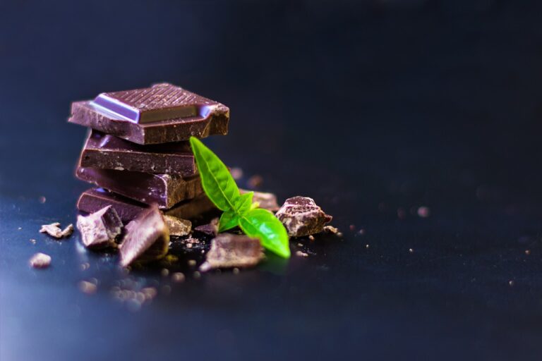
Color theory plays a crucial role in the presentation of food as it can evoke certain emotions and perceptions from diners. Colors like red and yellow are often used to stimulate appetite, while blue and green can have a calming effect. By understanding the psychology of colors, chefs can create visually pleasing dishes that not only look appealing but also enhance the overall dining experience.
In food presentation, the use of contrasting colors can create visual interest and make the dish more attractive. Combining colors that are opposite each other on the color wheel, such as red and green or purple and yellow, can make the dish stand out and draw the eye. Additionally, using colors that are similar in hue but different in saturation or brightness can create a sense of harmony and balance on the plate, making the dish visually appealing to diners.
Texture and Contrast in Plating
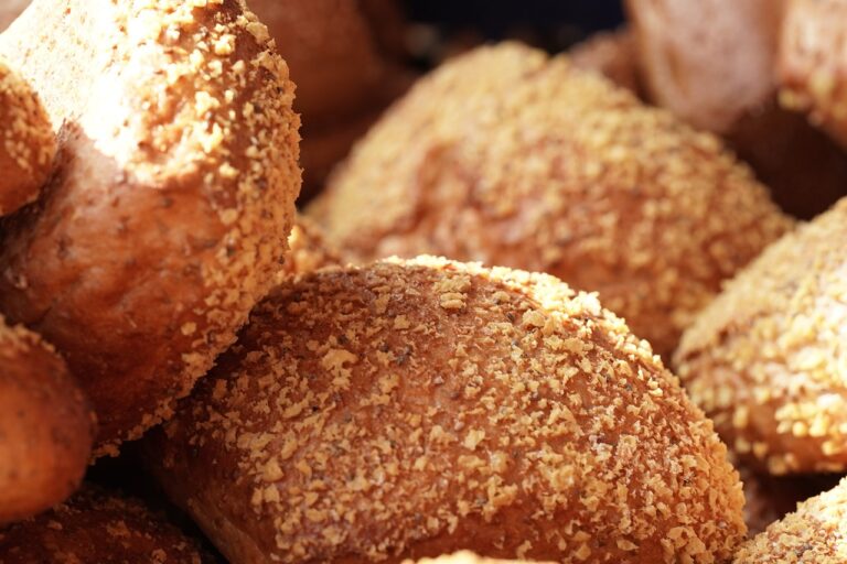
Texture plays a crucial role in creating visually appealing dishes that also delight the palate. A well-executed dish should offer a balance of textures, such as crunchy, creamy, and chewy elements, to create a harmonious experience for the diner. Incorporating a variety of textures not only adds interest to the presentation but also enhances the overall dining experience. This balance can be achieved through a thoughtful selection of ingredients and cooking techniques.
Contrast in plating involves pairing ingredients that differ in texture, flavor, color, or temperature to create a visually striking dish. Contrasting textures can elevate a dish by adding complexity and intrigue. For example, pairing a crispy seared protein with a velvety puree can create a dynamic contrast that excites both the senses and the taste buds. By carefully considering how different textures interact on the plate, chefs can elevate their presentations and create memorable dining experiences for their guests.
How can ingredients be used as a canvas for creativity in plating?
By arranging different elements of the dish in an artistic way, using various shapes, colors, and sizes, chefs can create visually appealing presentations that showcase their creativity.
How does color theory play a role in food presentation?
Color theory is important in food presentation as it helps create visual interest and balance on the plate. By using a mix of complementary colors, chefs can make their dishes more appealing and appetizing.
Why is texture and contrast important in plating?
Texture and contrast add depth and dimension to a dish, making it more visually appealing and exciting to eat. By incorporating a variety of textures and contrasting elements, chefs can create a more dynamic and memorable dining experience for their guests.